Upload the wrong PNG to App Store Connect and you lose an afternoon to rejection emails, blurry upscales, or awkward letterboxing that breaks every headline you tuned. Screenshot size is not a footnote in ASO — it is a technical gate that determines whether your creative ever reaches a user intact.
In 2026 most iPhone-first apps standardize on 1290 × 2796 portrait exports for the 6.7-inch display class. Pair that with template systems that lock layout, typography, and safe zones, and you get listing creative that scales across releases and locales without reopening Figma for every patch.
This guide explains App Store screenshot size requirements, how ASO templates reduce production drag, localization pitfalls, dual-store export parity with Play Store 1080 × 1920, and how an app store screenshot generator like StoreShots AI encodes dimensions so you focus on message — not pixel math.
Why App Store screenshot size still trips up teams
Apple publishes multiple iPhone display classes — 6.7-inch, 6.5-inch, 6.1-inch, and others for older hardware. Each class has prescribed pixel dimensions. Teams that ignore the spec sheet export at arbitrary sizes, rely on Connect to auto-resize, and wonder why text looks soft in search results.
Soft screenshots signal low quality next to crisp competitor listings. Users cannot articulate "that PNG was upscaled" — they just bounce. Correct size is table stakes before copy or color psychology enter the conversation.
Modern workflows bake size into export presets. Manual designers must discipline themselves; AI generators should fail impossible exports rather than silently blur.
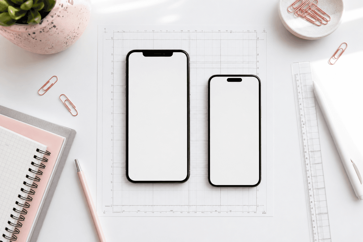
The 1290 × 2796 standard for iPhone 6.7-inch
For portrait iPhone screenshots targeting the 6.7-inch display class — the Pro Max family and equivalent — Apple expects 1290 × 2796 pixels. This is the size class most new apps prioritize when they do not maintain separate creative for every legacy phone.
Apple may use one uploaded set across related display sizes when aspect ratios align; maintaining a single master at 6.7-inch simplifies operations. Verify current App Store Connect documentation when Apple updates requirements — StoreShots tracks 1290×2796 as the default App Store export.
Portrait orientation dominates consumer categories: finance, health, productivity, social. Landscape sets matter for games and video apps — this guide focuses on portrait ASO templates because that is what most ASO screenshots workflows optimize for.
- Primary portrait size: 1290 × 2796 px (6.7-inch class)
- Up to ten iPhone screenshots per localization
- PNG recommended for gradients and sharp marketing type
- RGB color space; avoid unintended alpha issues on flat fills
- No upscaling from smaller simulator captures
Other iPhone size classes — when you need them
If you support older display classes with distinct aspect ratios, Apple may require additional asset sets. Many teams in 2026 ship 6.7-inch masters only and accept automatic scaling where Connect allows it — trading perfect legacy fidelity for operational simplicity.
iPad screenshots use separate dimensions entirely. Universal apps with meaningful tablet UX should invest in iPad-specific sets; phone-only products can defer.
When in doubt, prioritize the size class that drives the majority of your App Store impressions — usually 6.7-inch portrait for iPhone-first products.
Play Store parity: 1080 × 1920
Dual-store apps must export Google Play phone screenshots at 1080 × 1920 — not stretched from 1290 × 2796 iOS files. Aspect ratios differ slightly; stretching destroys headline legibility and UI sharpness.
Use one creative direction, two native exports. StoreShots AI handles App Store 1290×2796 and Play Store 1080×1920 from the same project. See our Play Store complete guide for feature graphic and Android-specific rules.
Template systems should parameterize canvas size so the same headline hierarchy reflows for each store without manual resize layers.
Create screenshots with StoreShots AIExport 1290×2796 and 1080×1920 from one project — no manual resize.What ASO templates actually are
An ASO template is not a single PNG overlay — it is a reusable ruleset: background treatment, headline box dimensions, font scale, device frame style, margin grid, and export preset. Templates encode lessons from hundreds of listings so each release swaps UI captures without redesigning layout from scratch.
Good Google Play screenshot templates and App Store equivalents define safe zones where text survives search thumbnail crop. They specify contrast minimums for OLED displays and spacing that keeps type off rounded device corners.
Bad templates are generic stock layouts with no export discipline — pretty in a design tool, wrong dimensions at upload time.
Building a template system for your app
Start from brand constraints: primary accent from your icon, neutral background that does not fight UI screenshots, one headline weight and one subtext weight. Define slide master layers — background, device frame, headline, subtext, optional badge.
Document export presets named explicitly: APP_STORE_1290x2796 and PLAY_STORE_1080x1920. Filename convention: locale_slideIndex_store.png. Version templates in git or your design system repo when humans touch them; AI generators version implicitly through project history.
Limit template variants. One master with seasonal accent swaps beats five unrelated styles that fracture brand recognition across the carousel.
- Extract palette from app icon and primary UI
- Define type scale readable at thumbnail size
- Set device frame style and margin grid
- Create slide masters for hero vs proof vs trust frames
- Encode export presets for iOS and Android
- Test thumbnail legibility in App Store Connect preview
- Lock template; swap captures per release
Template-driven vs one-off design
One-off design makes sense for a major rebrand once every few years. Template-driven production makes sense for every other Tuesday when you fixed onboarding and need slide two updated before the App Store review completes.
Indie developers without designers should default to AI-generated template baselines via an AI app screenshot maker. Enterprise teams may maintain Figma libraries mirroring the same rules — different tools, same principle.
The cost of skipping templates is delayed releases and stale listings. Users see new features in-app while store screenshots show last quarter's UI — trust erodes.
Headline safe zones and thumbnail cropping
App Store search results crop screenshot corners. Headlines placed flush to the top edge may lose characters. Templates should inset marketing copy within safe margins tested at smallest preview size.
Keep headlines to roughly four to seven words. Subtext can run longer if size hierarchy keeps primary message readable. Run the arm's-length squint test on every template revision.
Pair with copy guidance in how to write App Store screenshot copy — template geometry and wording work together.
Localization without breaking layout
German and Finnish strings expand; Thai line breaking differs from English. Templates need flexible text boxes or per-locale regeneration — not fixed-width overlays that truncate translations.
Regenerate ASO screenshots per locale with locked visual system and translated headlines. Manual Photoshop layers shatter when you add a third language or update UI.
Our localization guide walks upload paths in App Store Connect and Play Console; creative rules are identical across stores.
Create screenshots with StoreShots AIRegenerate localized sets at 1290×2796 while keeping template layout locked.Using an app store screenshot generator with templates
Upload high-resolution captures to StoreShots AI. Describe audience and outcome; the system applies template-like consistency — frames, backgrounds, headline placement — and exports at 1290×2796. Switch export target to Play Store for 1080×1920 without rebuilding slides.
Chat-edit individual slides when UI changes: replace capture, tweak headline, re-export. Unchanged slides should not require manual rework. That is template workflow behavior even when you never open a design file.
Read how it works for capture tips — garbage inputs break even great templates.
PNG vs JPEG for App Store uploads
Apple accepts PNG and JPEG for screenshots. PNG preserves sharp text edges and gradients when marketing overlays sit above UI captures. JPEG can introduce compression artifacts on small type — avoid it when headlines are part of the image.
File size limits are generous for screenshot counts; prefer quality over aggressive JPEG compression. Flat UI-heavy slides compress well as PNG; photo backgrounds may justify JPEG if type is minimal.
Connecting templates to ASO keyword strategy
Templates do not replace keyword research — they display the outcomes of that research visually. If you rank for "invoice scanner," template slide one should headline scanning outcomes above scanner UI, not generic "work smarter."
Keywords index in title, subtitle, and keyword field; screenshots convert the impression. Align template copy with highest-intent terms without stuffing every slide with comma-separated keywords.
Refresh template copy when ASO strategy shifts — new keyword clusters deserve new hero messaging, not just metadata edits.
Quality control before App Store Connect upload
Verify each PNG is exactly 1290 × 2796, RGB, readable at thumbnail, headlines truthful vs visible UI, no policy-risk claims, localized sets for priority territories, filenames organized by locale and index.
Use Connect's preview on multiple device sizes. Compare against store screenshot checklist for cross-store gates.
Keep a rollback folder of previous sets when testing radical template changes — store experiments need baselines to beat.
- Pixel dimensions match spec — no off-by-two exports
- No accidental transparency halos on backgrounds
- Device frames consistent across slides
- Captures reflect current shipping build
- Localized sets match localized metadata language
Simulator vs device captures for sharp exports
iOS Simulator exports at 1x can look soft when blown to marketing layouts. Prefer device screenshots or simulator captures at the native resolution of your target class before compositing on a 1290 × 2796 canvas.
Status bar time, battery, and carrier details should look realistic or be consistently clean — mismatched status bars across slides feel accidental. Some teams use marketing mode tools; others capture with a staged 9:41 time for Apple-esque polish.
Dark mode and light mode: pick the theme that matches your template background. Mixing dark UI on light marketing backgrounds without intentional contrast planning creates muddy frames.
iPad and Apple Watch assets — scope wisely
iPad screenshots use distinct dimensions from iPhone 6.7-inch masters. If tablet usage is under ten percent of your audience, defer iPad creative until product-market fit solidifies on phone. If iPad is core — design tools, pro workflows — budget separate template masters.
Apple Watch and Apple TV assets have their own classes; most apps skip until those surfaces drive meaningful installs. Phone-first template discipline keeps scope manageable for small teams.
A/B testing template variants
Apple Product Page Optimization tests alternate screenshot sets. Export variants at identical 1290 × 2796 so experiments isolate messaging or color — not aspect ratio. Change one variable per test: hero headline, background hue, or slide order.
Winning variants become the new template default. Losing variants inform what not to repeat. Document results so the next designer or AI prompt inherits institutional knowledge.
When to redesign templates vs swap captures
Swap captures only when UI changes but brand and positioning stay stable — same template, new screens. Redesign templates when you rebrand, reposition, enter new category, or competitor listings leapfrog your visual quality bar.
Major redesigns happen rarely; capture swaps happen often. Build process for the common case, not the once-a-year rebrand.
Create screenshots with StoreShots AITemplate-grade consistency on every export — see pricing for your release volume.Common size and template mistakes
Exporting at 1242 × 2688 or other legacy sizes then upscaling to 1290 × 2796 creates blur. Using one iOS PNG stretched to Play Store 1080 × 1920 wrecks typography. Mixing portrait and landscape slides without category reason confuses carousel flow.
Templates with trendy thin gray text fail accessibility and sunlight readability. Ten slides of identical layout with only headline swaps waste scroll depth — vary composition while keeping system consistency.
Accessibility and readability in template design
ASO templates must prioritize readable contrast — WCAG-minded contrast ratios help sunlight readability and reduce eye strain during quick store scans. Light gray marketing text on pastel backgrounds fails in real-world conditions even if it looks elegant in a design critique.
Font sizes in templates should assume the smallest preview context, not the full-resolution export viewed on a monitor. Test on a physical phone at arm's length before approving a new template version.
Accessibility also means honest representation: do not template-blur UI to hide unfinished features. Clear screenshots reduce support load and refund requests from misled installers.
Maintaining template libraries across a team
When multiple people touch listing creative, centralize the template source of truth — one Figma library, one StoreShots project, or one documented export folder in shared drive. Forking templates per teammate invites off-brand colors and inconsistent frame styles in the same carousel.
Version templates semantically: template_v3_rebrand, not final_new_2. Changelog what changed — new headline font, adjusted safe zone, darker background — so future editors understand constraints.
Quarterly template audits catch drift: are we still using last year's icon colors? Does slide five still reflect a feature we deprecated? Audits take an hour; stale listings cost installs all quarter.
2026 template checklist summary
Standardize App Store exports at 1290 × 2796 for iPhone 6.7-inch portrait. Pair with Play Store 1080 × 1920 from the same creative system. Build or generate templates that lock layout while allowing capture and copy swaps. Localize by regenerating headlines, not stretching English PNGs. Test thumbnails before submit.
Correct size plus coherent templates plus benefit-led copy equals ASO screenshots that earn installs instead of embarrassing your product.
Start a sized export in StoreShots AI, review pricing, and read App Store screenshots that increase downloads for narrative structure that fills your template frames.
FAQ
Questions about this topic
What is the App Store screenshot size for iPhone in 2026?
For 6.7-inch iPhone portrait listings, use 1290 × 2796 pixels. This is the standard most apps export when standardizing on one iPhone size class. StoreShots AI defaults to this dimension for App Store exports.
Can I upload one screenshot size for all iPhones?
Many teams upload 6.7-inch 1290×2796 sets and rely on App Store Connect scaling where permitted. Separate assets may be required for materially different aspect ratios or iPad listings — check Apple's current specifications.
What are ASO screenshot templates?
Reusable layout systems defining backgrounds, type scale, device frames, safe zones, and export presets. They let you update UI captures each release without redesigning from scratch — whether maintained in Figma or generated by AI.
How do templates work with localization?
Regenerate headline copy per locale while locking visual layout. Flexible text regions accommodate longer translations. Avoid fixed-width English overlays pasted into other languages.
Should App Store and Play Store templates match?
Match brand colors, story order, and headline hierarchy. Export separate native sizes — 1290×2796 for App Store, 1080×1920 for Play Store — never stretch one store's PNG to fit the other.
PNG or JPEG for 1290×2796 exports?
PNG for slides with marketing text or gradients. JPEG only when slides are photo-heavy without small type that compression would harm.
Does StoreShots AI handle template consistency?
Yes. Generation applies consistent frames, backgrounds, and headline placement across slides and exports at store-correct dimensions. Chat-edit individual slides without losing system consistency.
Sources
Official references used
- Screenshot specifications (Apple App Store Connect Help)
- App Store product page (Apple Developer)
Continue
Choose the next step
Related