The most useful app store screenshot examples are not individual listings to copy but reusable patterns: an outcome headline over a hero screen, a before/after slide, a panoramic background, a feature grid closer. Pick two or three patterns that fit your category, apply them to your real app UI, and keep one message per slide.
Copying another app's screenshots rarely works, because their layout was built around their UI, their audience and their brand. Patterns transfer. Below are 12 patterns with what each is, when it works, which kinds of apps suit it and where it goes wrong. The category examples are hypothetical illustrations, not descriptions of real listings.
12 app store screenshot patterns at a glance
Use this list as a menu. Most strong sets combine one opening pattern, one or two story patterns and one closing pattern.
- Outcome headline + hero screen: the result the user gets, over the screen that delivers it.
- Single-feature zoom: one UI element enlarged with a callout.
- Mascot-led slide: a character introduces or reacts to the app.
- Panoramic connected background: one continuous image spanning several slides.
- Onboarding-to-result story: slides follow the user path from start to payoff.
- Before/after: the messy state next to the organized state.
- Comparison to the manual way: the old method versus your app.
- Social proof slide: real ratings, press or usage data, only if verifiable.
- Persona slide: a slide speaking to one specific user type.
- Localized headline: copy rewritten for a market, not just translated.
- Dark-mode showcase: a slide that shows the app in its dark appearance.
- Feature grid closer: a final slide summarizing secondary features.
Opening patterns: winning the first slide
1. Outcome headline + hero screen. A short headline states the result (“Know where every dollar went”) above the single app screen that delivers it. It works for almost any app whose value can be shown on one screen, and it is the safest default first slide. A budgeting app might pair the headline with its monthly overview. Pitfall: writing a feature label (“Smart categories”) instead of an outcome, or choosing a busy screen that is unreadable at thumbnail size. Our guide to writing App Store screenshot copy covers outcome wording.
2. Single-feature zoom (callout). One UI element, such as a chart, a button or a timer, is enlarged beyond the device frame with an arrow or highlight. It works when your differentiator is a small detail that disappears at full-screen scale. A sleep app might zoom into its sleep-stage graph. Pitfall: zooming so far that the element loses context, or blurring it by upscaling a low-resolution capture.
3. Mascot-led slide. A character greets the visitor, points at the UI or reacts to progress. It works for apps with a playful, consistent brand voice, such as kids' learning, habit building or casual games. Pitfall: a mascot that covers the UI or appears only once, which reads as decoration rather than identity. If you do not have one yet, the AI mascot generator can create a consistent character to use across slides.
Story patterns: connecting slides into a sequence
4. Panoramic connected background. One continuous illustration or gradient runs across several slides, so the set reads as a single strip when scrolled. It works well for design-led brands and for nudging visitors to swipe. A travel planner might run a route line across three slides. Pitfall: key elements landing on slide edges, and the set falling apart when you later reorder or test individual slides.
5. Onboarding-to-result story. Slides follow the real user path: set a goal, take the core action, see the result. It suits apps with a clear flow, such as a language app moving from picking a level to finishing a lesson to seeing a streak. Pitfall: spending the opening slides on setup screens nobody cares about; lead with the result and tell the story after.
6. Before/after. A messy or painful state sits next to the organized result, either split on one slide or across two. It works for organizers, photo editors, scanners and cleanup utilities. A receipt scanner might show a crumpled receipt beside a tidy expense entry. Pitfall: an exaggerated “after” that your app cannot actually produce, which invites bad reviews.
7. Comparison to the manual way. The slide contrasts the old method (spreadsheets, paper notes, five separate apps) with your app doing it in one place. It works when your audience already solves the problem manually. A shift-scheduling app might contrast a group chat thread with its schedule view. Pitfall: naming or depicting competitor products; compare against a method, not a brand.
Trust and audience patterns: who it is for and why to believe it
8. Social proof slide (only with real data). A slide shows a verifiable rating, a real press mention or genuine usage numbers. It works once you actually have that evidence. Pitfall: invented or unverifiable claims. Store policies restrict misleading metadata, and Google Play guidance discourages ranking-style claims such as “#1” or “best” in graphics, so check current policy and keep receipts for anything you state.
9. Persona slide. One slide speaks to a specific user: “For freelancers who invoice on the go.” It works for apps with two or three distinct audiences, such as a note app serving students and researchers. Pitfall: listing so many personas that the set no longer says who the app is for. Persona slides also make good custom product page variants.
10. Localized headline. The headline is rewritten for a market's phrasing and priorities instead of translated word for word, while the UI capture is in the same language. It works for any app with meaningful non-English traffic. Pitfall: shipping translated headlines over English UI, or text that overflows in longer languages. See localizing App Store screenshots for the workflow.
Closing and showcase patterns: finishing the set
11. Dark-mode showcase. One slide shows the app in its dark appearance, often with a darker background. It works for apps used at night or for long sessions, such as readers, developer tools, sleep or focus apps. Pitfall: using it as an early slide when most users will see the light theme, or dark slides that turn muddy next to light ones.
12. Feature grid closer. The final slide lists four to six secondary features with icons or small crops. It works for apps with breadth, such as utilities and productivity suites, catching visitors who scroll to the end. Pitfall: leading with a grid. Grids are scannable but rarely persuasive, so they belong at the end.
Build a screenshot set from your real appUpload 3–10 screenshots and get headlines, themes and export-ready PNGs.Which screenshot patterns fit your app category?
Category shapes expectations. These pairings are starting points, not rules; your own audience research and testing should override them.
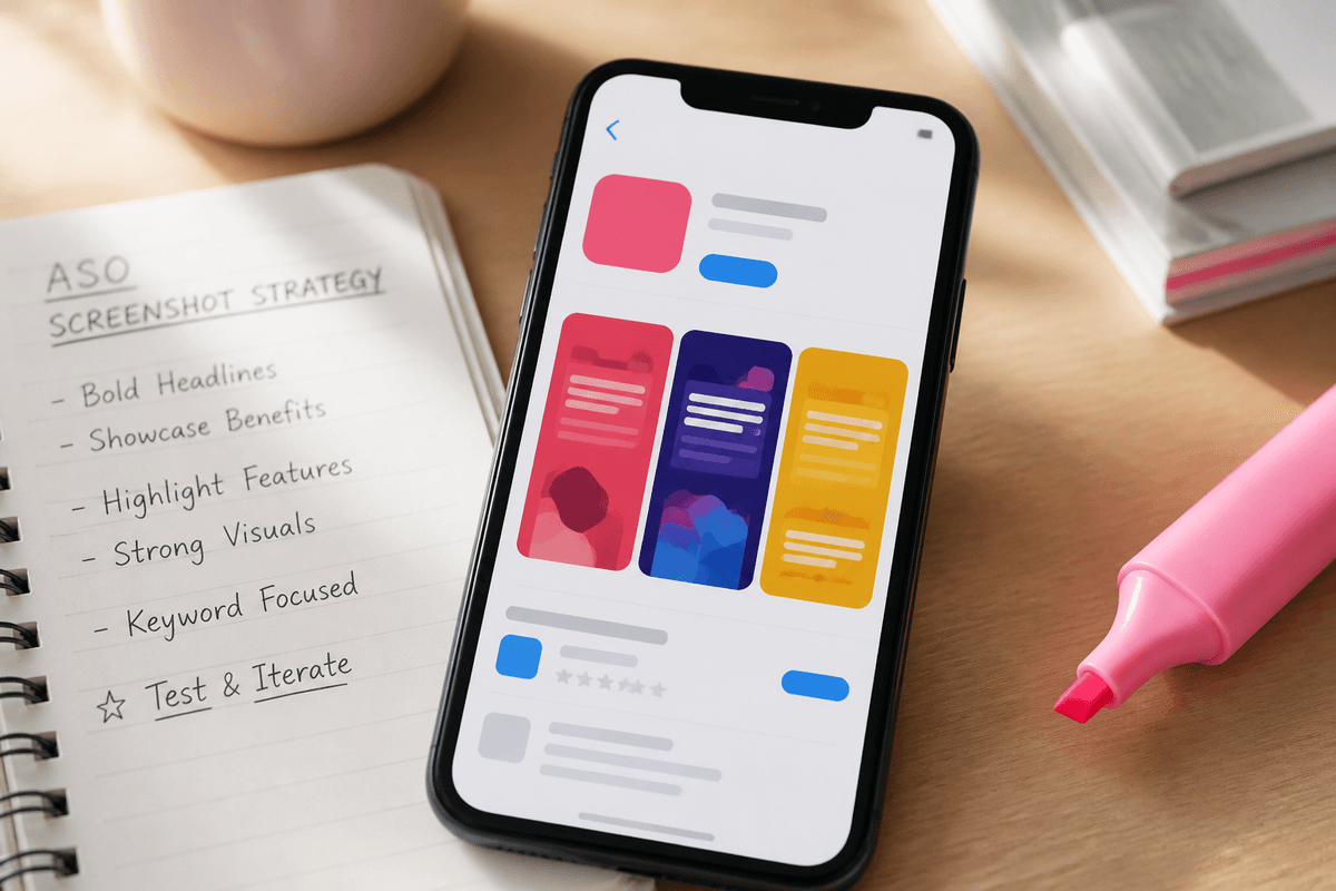
- Fitness: outcome headline over a progress screen, onboarding-to-result story, dark-mode showcase for workout timers.
- Finance: outcome headline, before/after (scattered accounts to one overview), comparison to spreadsheets; social proof only if verifiable.
- Productivity: single-feature zoom on the core interaction, comparison to the manual way, feature grid closer.
- Games: panoramic connected background, mascot-led slides, clear gameplay moments in place of UI explanation.
- Education: mascot-led opener, onboarding-to-result story (level to lesson to streak), persona slides for learners and parents.
- Utilities: before/after, single-feature zoom, feature grid closer for breadth.
How to combine patterns into a 6–8 slide set
A pattern only works in context. Plan the whole sequence before designing a single slide; the screenshot order that converts goes deeper on slide positions.
- Pick one opening pattern for slide one: usually outcome headline + hero screen.
- Use slides two and three for your strongest differentiator, often a zoom or before/after.
- Add one story or trust pattern in the middle: onboarding-to-result, persona or real social proof.
- Add a dark-mode or localized variant only where it serves your audience.
- Close with a feature grid if the app has breadth worth summarizing.
- Check every slide at thumbnail size and remove any second message.
Mistakes that break any screenshot pattern
Patterns fail in predictable ways, and usually not because the pattern was wrong. Most broken sets share the same handful of execution problems, regardless of category. Run through this checklist before you export, and again whenever you add a slide or a new localization.
The common thread is respect for the visitor's attention. Someone scrolling search results gives your listing a second or two, often at thumbnail size, before deciding whether to open the product page. A pattern earns its place only if it makes the message faster to understand at that size.
- Two messages on one slide: a headline and a subhead that each make a different claim.
- Headlines too small to read in search results, especially on slides one to three.
- Mixing three or more background styles so the set looks like several apps.
- Mockup UI that does not match the shipped app, which sets up disappointment after install.
- Stretching one export to fit both stores instead of producing native 1290×2796 and 1080×1920 files.
- Claims you cannot back up, including ratings, user counts or “award-winning” labels.
- Ignoring dark or light context: a dark slide among light ones should look deliberate, not accidental.
Generated examples: StoreShots sample packs
If you want to see several of these patterns applied to complete sets, browse the StoreShots sample packs. They are generated demonstrations of the workflow, not customer case studies, and they show how outcome headlines, themes and slide order come together at export size.
To build your own, StoreShots takes 3–10 real screenshots from your app, maps each screen to a purpose, headline, subtext and visual theme, and exports App Store iPhone PNGs at 1290×2796 and Google Play phone PNGs at 1080×1920. Your uploaded UI stays the source; it does not redraw your app. It does not create iPad sets or Play feature graphics, so plan those separately. When you are unsure which pattern to lead with, test it: our app store screenshot A/B testing guide shows how to run patterns against each other.
FAQ
Questions about this topic
What are the best app store screenshot examples to follow?
The best examples to follow are patterns, not specific listings. Outcome headline over a hero screen, single-feature zoom, before/after and a feature grid closer adapt to most apps. Apply them to your own real UI and audience instead of copying another app's layout, which was designed around different screens.
What should the first app store screenshot show?
The first screenshot should show the main outcome your app delivers, on the screen that delivers it. A short outcome headline plus one readable hero screen is the safest default, because the first slides appear in search results and must make sense at thumbnail size.
How many patterns should one screenshot set use?
Most strong sets use three or four patterns across six to eight slides. Typically that is one opening pattern, one or two story or trust patterns in the middle and a closing pattern. Using more makes the set feel inconsistent, and each slide should still carry only one message.
Are panoramic connected backgrounds worth the effort?
Panoramic backgrounds are worth it for design-led brands and games, but they add maintenance cost. They encourage swiping and look cohesive, yet any reorder, localization or A/B test can break the continuity. Keep key elements away from slide edges so individual slides still work alone.
Can I put ratings or awards in my screenshots?
Only if the claim is real, current and verifiable. Store policies restrict misleading metadata, and Google Play guidance discourages ranking-style claims such as “#1” or “best” in graphics. Check the current Apple and Google policies, and avoid invented numbers or testimonials entirely.
Are the StoreShots sample packs real customer screenshots?
No, the StoreShots sample packs are generated demonstrations of the workflow, not customer case studies. They show how patterns like outcome headlines and consistent visual themes look in complete, export-sized sets. Your own pack is built from the real screenshots you upload.
Sources
Official references used
- Screenshot specifications (Apple App Store Connect Help)
- App Store product page (Apple Developer)
- Add preview assets: screenshots and graphics (Google Play Console Help)
Continue
Choose the next step
Related