The core app screenshot design best practices are: make the first three slides carry your strongest story, give each slide one clear hierarchy (headline, then UI), use type large enough to read at thumbnail size, keep strong contrast, pull colors from your icon, and apply one consistent background, frame and layout system across every slide.
Design is what makes good copy and good UI readable in the few seconds a shopper spends on your listing. You do not need an agency to get it right; you need a small set of rules applied consistently. This guide covers hierarchy, legibility, color and backgrounds, device frames, safe areas, dark mode, localization, Apple's guidelines on what not to do, and a pre-export checklist you can run before every upload.
Why do the first three screenshots matter most?
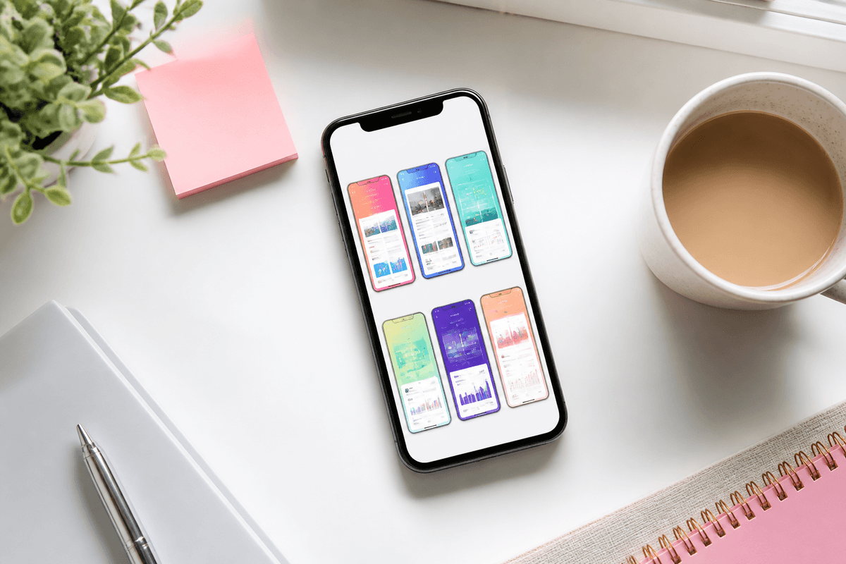
In App Store search results, only the first few screenshots are visible next to your icon and title, typically three portrait slides on iPhone. Many people decide whether to tap from that strip alone. On your product page the carousel shows more, but attention still falls off quickly after the opening slides.
Design the first three as a unit. They should share one background treatment, one headline style and one frame style so they read as a single panel, and together they should communicate what the app does, how it works and why it is different. Put your clearest, most visually distinctive screen first; a settings list or login screen in position one wastes the most valuable pixels you have. Our guide to screenshot order that converts covers sequencing in detail.
How to build visual hierarchy on each slide
Every slide needs an obvious reading order. In almost every effective app store screenshot design, that order is headline first, then the UI that proves it, then optional subtext. If a viewer's eye lands on a decorative shape or a tiny badge first, the hierarchy is broken.
Size and position do most of the work. Put the headline in the top third, set it at least twice the size of any subtext, and let the device or UI occupy the remaining space as the dominant visual element. Use one accent color for emphasis rather than three. Copy is half of hierarchy, so pair this with our guide on writing App Store screenshot copy.
- One focal point per slide: the headline or the key UI moment, not both competing
- Headline in the top third, consistently placed across all slides
- Subtext clearly smaller and lighter, or omitted entirely
- Device mockup centered or aligned to a consistent grid line
- Crop or zoom into the important part of the UI when the full screen is too dense to read
- Avoid callout arrows, stickers and badges unless they point to something essential
Type size, contrast and accessibility at thumbnail size
Your slides are exported at full resolution (1290×2796 for the main iPhone size, 1080×1920 as a common Google Play size), but they are judged at thumbnail size. Headline type that looks generous in your design tool can be unreadable in search results. A useful starting point is a headline cap height of roughly 4–6% of the slide's height, then verify by viewing the export at about 20% scale on a real phone.
Contrast matters more at small sizes. Aim for at least the WCAG 4.5:1 contrast ratio between headline text and its background, and higher for thin or light font weights. Bold or semibold weights survive downscaling better than light ones. Avoid placing text over photos or busy gradients unless you add a solid or blurred backing.
- Use a bold or semibold weight for headlines; avoid hairline and light weights
- Check headline contrast against WCAG's 4.5:1 guidance with any contrast checker
- Do not rely on color alone to convey meaning; pair color with a label or icon
- Keep line length short; two lines is a practical maximum for headlines
- Test in grayscale: if the hierarchy disappears, contrast is too low
- Respect users with low vision by never shrinking text to fit more words
Choosing colors and screenshot backgrounds
Start from your brand: pull one primary and one accent color from your app icon or main button color. When the screenshots echo the icon, the listing reads as one product and users can connect it to the app on their home screen later. Keep the palette to two or three colors plus neutrals.
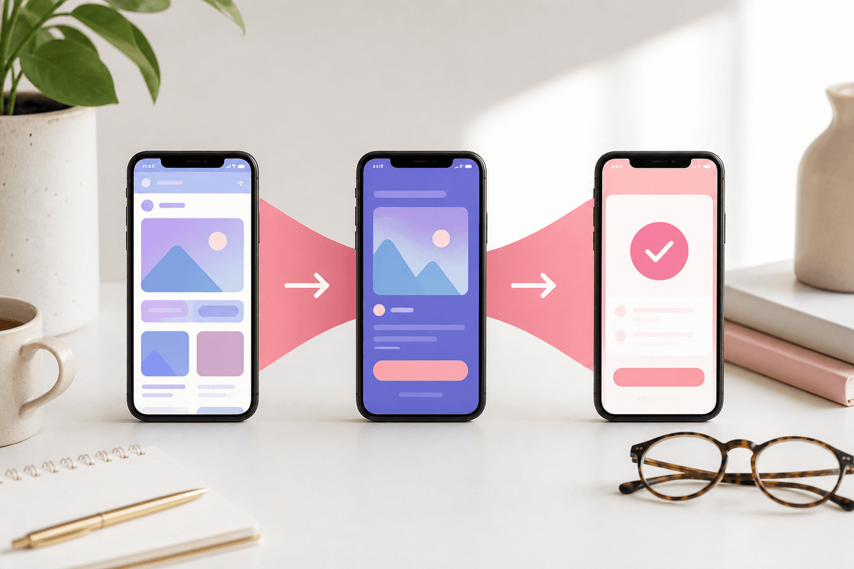
For the screenshot background, soft gradients or subtle textures usually look more intentional than flat gray, but the background must never compete with the UI. Panoramic backgrounds, where one continuous image or gradient flows across several slides, can make the first three slides feel like a single banner. They are worth the effort only if each slide still works on its own, because Google Play and some App Store layouts show slides individually and users can land mid-carousel.
- Gradients: two adjacent hues from your brand palette; avoid harsh rainbow blends
- Solid backgrounds: fine for minimal brands, but add depth with a shadow on the device
- Panoramic: align seams to the exact slide width and never split a headline or device across a seam
- Photography: use only when it reinforces context (travel, food, fitness) and keep text off busy areas
- Category contrast: look at the top results for your keywords and choose a background that stands out from them
Device frame mockup vs frameless screenshots
A device frame mockup signals "this is a real phone app" and gives the UI a clear edge against the background. It works well for most consumer apps, especially when the background is colorful. The trade-off is space: a frame shrinks the visible UI, which can hurt dense screens.
Frameless designs (the UI as a rounded card, or a zoomed crop of a key element) give more room to the interface and feel modern. They suit apps where the UI itself is the selling point, and games, which usually show full-bleed gameplay. Whichever you choose, use it on every slide. Mixing framed and frameless slides is one of the quickest ways to make a listing look unfinished. Also avoid showing a specific non-current device model that dates your listing, and do not show an iPhone frame in your Google Play screenshots.
Safe areas, cropping and app screenshot layout
Keep headlines and important UI away from the slide edges. Leave a margin of roughly 5–8% of the slide width on each side so nothing feels cramped in the carousel and nothing is lost if a surface rounds corners or crops slightly. Keep the same margins on every slide so headlines line up when slides sit side by side.
Clean up your captures before they go into the layout. Use realistic but tidy demo data, a full battery and a neutral time in the status bar; on iOS, the Simulator's status bar override (xcrun simctl status_bar) makes this repeatable. Make sure the right export sizes go into the right slots: see our App Store screenshot size guide and the Google Play size requirements.
- Side margins around 5–8% of slide width; top margin above the headline at least as large
- Never let a device frame or UI run into the headline area
- Crop into the meaningful part of long screens instead of shrinking the whole screen
- Use a consistent grid: same headline baseline and device position on every slide
- No personal data, real customer names or placeholder "lorem ipsum" in demo content
Consistency system, dark mode and localization space
Treat your store listing design as a template, not a series of one-off posters. Define the font, sizes, colors, background treatment, frame style, corner radius, shadow and margins once, then reuse them every release. A template is what lets you swap in new UI captures after an update without redesigning the set.
If your app supports dark mode, decide deliberately which appearance to show. A dark UI on a dark background can disappear at thumbnail size, so add contrast with a lighter background or a glow. Some teams dedicate one slide to dark mode as a feature. For localization, leave headline space for languages that run longer than English, and do not shrink type per locale; adjust line breaks instead. Our screenshot localization guide covers the full workflow.
- Lock one type scale, one frame style, one corner radius and one shadow for all slides
- Store the system as a template so updates only replace UI captures and copy
- Dark UI on dark backgrounds needs extra edge contrast
- Design headline areas with spare room for longer translations
- Localize UI captures too, so the headline language matches the app language
What not to do: Apple's guidelines and misleading screenshots
Apple's App Review Guidelines say screenshots should show the app in use, not merely title art, a login page or a splash screen. Metadata, including screenshots, must accurately reflect the app's core experience. Google Play's policies similarly prohibit misleading store listing content. Beyond rejection risk, a listing that oversells creates disappointed users and poor reviews.
Design choices can mislead even when the UI is real. Mockups of features that are not shipped, edited UI that the app cannot produce, or fake system notifications all cross the line. Keep the polish in the presentation layer (background, frame, type) and keep the UI honest.
- Do not use splash screens, login screens or logo-only slides as your screenshots
- Do not show features that are not in the shipped version
- Do not imitate system UI, alerts or Apple and Google badges in a misleading way
- Do not add unverifiable claims like "#1 app" or invented ratings
- Do not use transparent PNGs; Apple and Google Play both reject images with alpha
Quick reference: screenshot design specs and rules
These are the facts and defaults worth keeping beside your design file. Apple and Google update requirements, so confirm current specifications in App Store Connect and Play Console before you upload.
- Apple: up to 10 screenshots per device size per localization; PNG or JPEG, no transparency
- Apple 6.9-inch iPhone slot accepts 1320×2868, 1290×2796 and 1260×2736 portrait
- Apple requires a 13-inch iPad set (2064×2752 or 2048×2732) if your app runs on iPad
- Google Play: 2–8 phone screenshots; JPEG or 24-bit PNG without alpha; 1080×1920 portrait recommended
- Google Play: long side no more than 2.3 times the short side; 320px minimum, 3840px maximum per side; 9:16 at 1080×1920 or larger recommended
- Google Play also requires a 1024×500 feature graphic, designed separately from screenshots
- Design rule of thumb: 3–7 word headlines, bold weight, 4.5:1 contrast or better, 5–8% side margins
Pre-export checklist for app store screenshot design
Run this list on the actual exported files, viewed on a phone, before uploading. For a broader submission check covering metadata and sizes, use our store screenshot checklist. If you would rather start from a consistent system than build one, StoreShots AI takes 3–10 real screenshots of your app, applies one visual theme with headlines across the pack, and exports App Store PNGs at 1290×2796 and Google Play PNGs at 1080×1920 in a ZIP. It does not create iPad sets, feature graphics or preview videos, so plan those separately. Credits are one-time packs with no subscription; see pricing.
- The first three slides tell the core story on their own
- Every headline is readable at about 20% scale on a phone
- Headline contrast meets 4.5:1 or better on every slide
- Colors echo the app icon; palette limited to two or three colors plus neutrals
- Same font, frame style, margins and headline position on every slide
- No text or UI touches the slide edges; panoramic seams line up
- Status bars are clean and demo data is realistic and private
- Every screen shows the shipped app in use, with no misleading mockups
- Each locale's headlines fit without shrinking type, and UI language matches
- Files are the correct pixel size, PNG or JPEG, with no alpha channel
FAQ
Questions about this topic
What are the most important app screenshot design best practices?
Prioritize the first three slides, give each slide a clear headline-then-UI hierarchy, and keep type readable at thumbnail size. Then apply one consistent system of colors, background, frame and margins across every slide, and make sure every screen shows the real app in use.
Should I use device frames in App Store screenshots?
Device frames are a good default for most consumer apps, but they are optional. Frames make the UI read as a phone app; frameless layouts give more space to dense interfaces. Choose one approach and use it on every slide rather than mixing styles.
What background works best for app screenshots?
A soft gradient or subtle texture built from your app icon's colors works for most apps. The background should support the UI, not compete with it. Choose colors that stand out from competitors in your category and keep contrast high behind headlines.
How big should text be on app store screenshots?
Make headline text large enough to read when the slide is shown as a search-result thumbnail. A starting point is a cap height around 4–6% of slide height in a bold weight, then confirm by viewing the export at about 20% scale on a phone.
Can App Store screenshots show features that are not built yet?
No, screenshots should show the app as it actually works. Apple's App Review Guidelines say screenshots should show the app in use and metadata must reflect the core experience. Showing unreleased features risks rejection and disappointed users who leave poor reviews.
Should screenshots use light or dark mode?
Use whichever appearance makes your UI clearest and matches most users, usually light mode. If dark mode is a selling point, dedicate one slide to it. Dark UI on a dark background needs extra contrast, such as a lighter backdrop, so it does not disappear at thumbnail size.
Sources
Official references used
- Screenshot specifications (Apple App Store Connect Help)
- App Store product page (Apple Developer)
- App Review Guidelines (Apple Developer)
- Add preview assets: screenshots and graphics (Google Play Console Help)
Continue
Choose the next step
Related