When someone discovers your app in the App Store or Google Play, they decide in seconds — not minutes. Most visitors never read your full description, scroll through every review, or compare feature lists line by line. They scan the icon, glance at the rating, and swipe through your screenshot carousel. That carousel is your storefront window, and in 2026 it carries more conversion weight than ever as organic discovery gets noisier and paid acquisition costs climb.
Developers routinely spend months shipping product and only an afternoon on listing visuals. The result is predictable: flat conversion rates, high bounce from search impressions, and wasted spend on traffic that never installs. Strong ASO screenshots explain value immediately, show real product proof, and build enough trust for a tap on Get. Weak ones send users to the next competitor before they understand what you built.
This guide walks through the psychology, structure, copy, and production workflow behind App Store screenshots that actually increase downloads — including how an app store screenshot generator like StoreShots AI compresses a multi-hour design process into minutes without sacrificing store-ready export quality.
Why screenshots matter more than your feature list
Think about your own behavior the last time you searched for an app. You probably opened three or four listings, skimmed the first screenshot of each, and installed the one that communicated an outcome you recognized. Apple and Google surface screenshots in search results, product page headers, and editorial placements — they are not decorative assets filed away after launch.
Effective ASO screenshots do five jobs at once: they explain the core benefit, demonstrate that the app is real and maintained, differentiate you from template competitors, reduce anxiety about install size or complexity, and create enough emotional resonance that tapping Install feels obvious. Miss any one of those on slide one and you lose the visitor before slide two loads.
Conversion data from ASO practitioners consistently shows that listing creative refreshes produce measurable install lifts when messaging aligns with user intent. Screenshots are the highest-leverage creative you control without changing your binary.
The first screenshot is your hero — treat it like a billboard
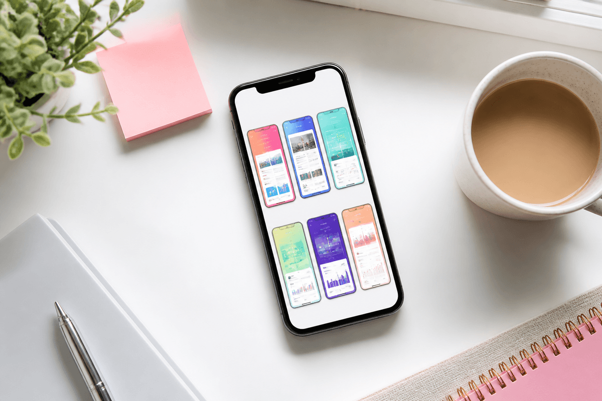
The first App Store screenshot appears largest in search and sets the narrative for every slide that follows. The most common mistake is opening with a generic dashboard, a settings screen, or a logo splash that tells the user nothing about why they should care. Your hero slide must answer one question in under three seconds: why should I install this app?
For a fitness tracker, lead with "Track workouts and hit goals faster" above the screen where a user logs a completed session. For personal finance, "See where every dollar goes" above a clean spending breakdown. For language learning, "Learn Spanish in ten minutes a day" above a lesson in progress. The headline is the promise; the UI beneath is the proof.
Keep the app name on slide one only. Repeating your brand on every frame wastes precious headline space and trains users to ignore your copy. Let the product speak through consistent visual language instead.
Benefits beat features every time
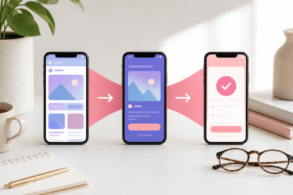
Internal feature names do not convert browsers into installers. "Task Management Module" describes your org chart; "Finish projects on time" describes the user's life getting easier. Every slide should translate a capability into an outcome the visitor already wants.
Run this quick audit on your current set: read each headline aloud and ask whether a stranger would know what improves in their day. If the answer is no, rewrite before you touch gradients or device frames. AI copy suggestions from an AI app screenshot maker can accelerate drafting, but you still own the benefit hierarchy — machines suggest, you decide what matters most.
Pair each benefit headline with UI that visibly delivers it. If the copy says "Split bills in one tap," show the tap target or completed split — not an unrelated profile page. Misalignment between words and pixels erodes trust faster than ugly colors.
- Feature: AI suggestions → Benefit: "Get smarter recommendations instantly"
- Feature: Analytics dashboard → Benefit: "Understand your growth at a glance"
- Feature: Offline mode → Benefit: "Keep working without signal"
- Feature: Widgets → Benefit: "See what matters from your Home Screen"
Keep headline copy short and scannable
Users scroll the carousel quickly, often on a small phone in bright sunlight. Headlines should land in roughly three to seven words; supporting subtext can stretch to eight or fifteen if contrast and size hierarchy stay readable at thumbnail scale.
Compare these two approaches. Weak: "Our advanced productivity platform helps teams collaborate through a unified task management environment with real-time sync." Strong: "Collaborate with your team" with subtext "Assign tasks and finish projects faster." The second version survives cropping in App Store search results; the first becomes illegible noise.
Write copy for the smallest surface your screenshot will appear on, not the full-resolution export. If it works as a thumbnail, it works everywhere else.
Build a visual story across five to seven slides
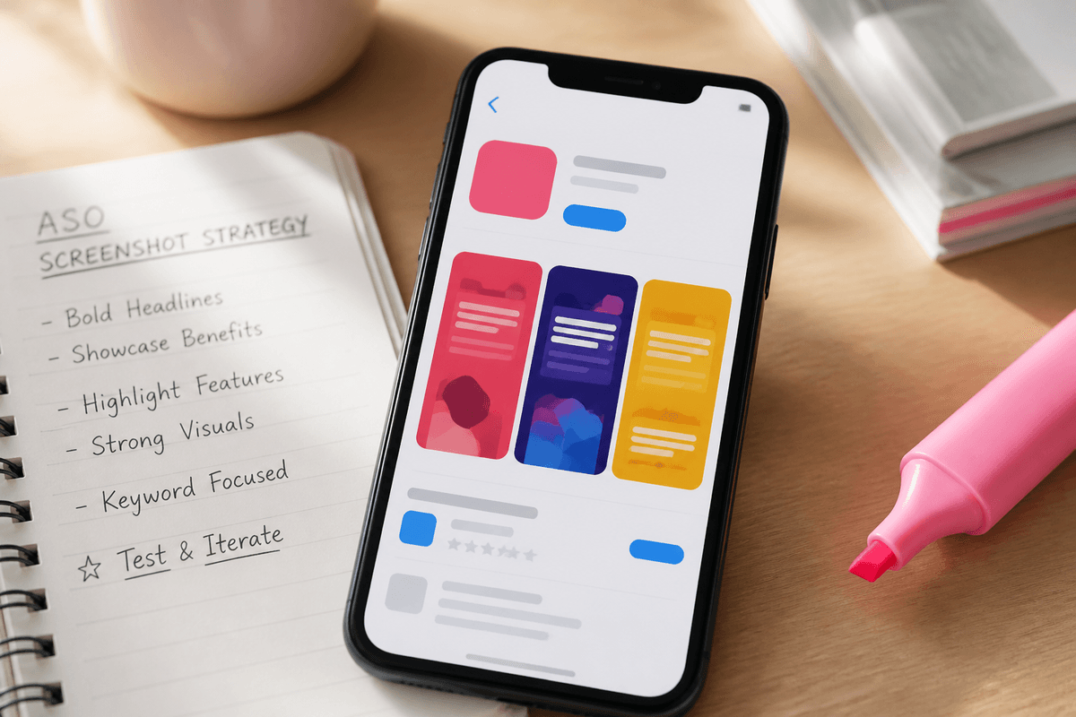
Apple allows up to ten iPhone screenshots per localization. High-converting indie and mid-size apps typically ship five to seven slides: enough arc to tell a story without exhausting scroll depth. Think of the sequence as a sales presentation, not a feature dump.
A proven narrative order: (1) hero outcome, (2) primary workflow, (3) differentiator competitors hide, (4) depth or secondary persona use case, (5) trust signal, (6) optional social proof with verifiable numbers, (7) soft call to action about what happens right after install. You do not need all seven if a slide would repeat the same message.
For deeper slide-order tactics, see our companion piece on App Store screenshot order that converts. The order matters as much as individual frame polish.
- Slide 1 — Hero outcome tied to daily-use UI
- Slide 2 — Core workflow that delivers the outcome
- Slide 3 — Differentiator presented as a headline, not a settings label
- Slide 4 — Secondary module, integration, or persona-specific scenario
- Slide 5 — Trust: ratings snippet, user count, security cue if authentic
- Slide 6 — Social proof or comparison frame with real numbers only
- Slide 7 — Soft CTA: free trial, no account required, instant value
Consistency signals quality — chaos signals neglect
Random background colors per slide, mixed typography, and inconsistent spacing make even a great app look like a weekend project. Premium listings share a visual system: one palette derived from your icon, one headline font weight, one spacing rhythm, one device frame style across the entire set.
Consistency also speeds production. When you define backgrounds, type scale, and frame treatment once, updating screenshots after a release means swapping UI captures — not redesigning from scratch. That is exactly where template-driven ASO screenshots earn their keep for teams that ship often.
Pull accent colors from your app icon so store visitors connect the listing to the home screen icon they will tap after install. Subtle repetition builds recognition without shouting your logo on every frame.
Device frames: polish without hiding the product
Device frames add realism, create structure around messy full-bleed UI, and help users instantly recognize that they are looking at a phone app — not a web dashboard screenshot accidentally uploaded. Used well, frames improve hierarchy by constraining the canvas.
Avoid oversized bezels that shrink your actual interface into a postage stamp. The UI should remain the focal point; the frame is scaffolding. Match frame style to your brand tone: minimal chrome for productivity tools, bolder hardware cues for creative apps if that fits your category norms.
StoreShots AI applies consistent device frames during generation so you do not manually align masks in Figma for every release.
Export at the correct App Store screenshot size
Incorrect dimensions cause rejected uploads, blurry upscales, or awkward letterboxing that breaks your carefully tuned layout. For iPhone 6.7-inch listings — the size class most teams standardize on in 2026 — export portrait screenshots at 1290 × 2796 pixels.
Google Play phone screenshots use 1080 × 1920 portrait. If you ship on both stores, maintain one creative direction but export separate size classes rather than stretching a single PNG. Stretching destroys text legibility and makes your listing look amateurish next to competitors who export natively.
StoreShots exports App Store at 1290×2796 and Play Store at 1080×1920 from the same project. See how it works for the capture-to-export flow and our App Store screenshot size and templates guide for dimension deep-dives.
Localize screenshots — not just metadata
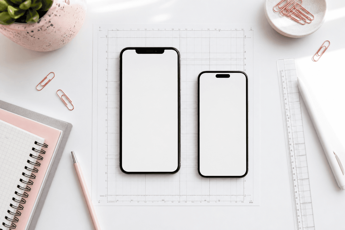
Translating your title and description while leaving English screenshots is a common ASO gap. Users in non-English markets trust listings that speak their language end to end. Localized headlines alone can lift conversion in priority locales without changing your product binary.
Localize marketing overlays you control: slide headlines, subtext, and callouts. When your app supports locale-specific UI, capture builds in those languages for authenticity. German strings run long; plan shorter headline variants or looser text boxes so layout does not break.
Regenerate localized sets rather than pasting translated text in Photoshop — manual overlays shatter the moment you add a second language or update UI. Tools that regenerate copy per locale while locking layout save days on multilingual launches.
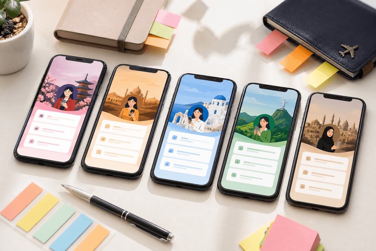
Common screenshot mistakes that kill conversion
Tiny unreadable text is the fastest way to waste a search impression. If you squint at arm's length and cannot read the headline, neither will users scrolling in a subway.
Raw captures without context force visitors to reverse-engineer your value prop. Menus, empty states, and onboarding permission dialogs almost never belong in marketing carousels unless the headline explicitly sells that moment.
Showing too many unrelated features on consecutive slides creates cognitive whiplash. Each slide should advance one clear idea. Poor contrast between text and background makes copy disappear on OLED screens turned to max brightness.
Random slide ordering — proof before promise, or CTA before demonstration — confuses the narrative. Using competitor trademarks, unverifiable #1 claims, or income guarantees invites policy risk and refund churn.
- Unreadable type at search thumbnail size
- Headlines that do not match on-screen UI
- English-only visuals in localized store listings
- Upscaled low-resolution captures
- Ten slides that repeat the same message
- Logo splash as slide one with no user benefit
Align screenshots with search intent and keywords
ASO screenshots are not keyword stuffing canvases, but they should reflect the jobs users associate with your category. If you rank for "budget tracker," slide one should scream budgeting outcomes, not generic productivity. Match visual story to the queries and Apple Search Ads terms that already drive impressions.
Your subtitle and keyword field still matter for indexation; screenshots matter for conversion after the impression. Together they compound: keywords bring visitors, screenshots close them.
Refresh creative when you reposition or when competitor listings in your category raise the visual bar. Stale screenshots that show UI you redesigned two versions ago signal abandonment.
Speed up production without cutting corners
Traditional screenshot workflows chain disconnected tools: capture on device, import to Figma or Photoshop, write copy in a doc, add frames, resize for each store, export PNGs, upload to App Store Connect, repeat after every UI change. That path easily consumes half a day per release for solo developers and multiplies across locales.
Modern app store screenshot generator workflows collapse those steps. Upload raw captures, describe your app or audience, generate ASO headlines and styled layouts, chat-edit individual slides when UI shifts, and export store-sized PNGs in one session. Teams report going from hours to minutes for routine refresh cycles.
Speed matters because screenshots are not one-and-done. Every meaningful UI update, pricing change, or seasonal campaign deserves creative that matches reality. If production is slow, teams skip updates — and conversion drifts down while the product improves.
Measure, iterate, and run store experiments
Apple Product Page Optimization and Google Play Store Listing Experiments let eligible accounts test alternate screenshot sets against baselines. Export variants at identical dimensions so tests isolate messaging, not aspect ratio noise.
Watch install rate — installs divided by product page views — not vanity impressions alone. A beautiful set that attracts wrong-fit users increases uninstalls; a clear set may slightly reduce page views while lifting qualified installs.
Pair screenshot tests with review sentiment and support tickets. If users say "I thought the app did X" and your hero slide implied X, fix copy before running another paid burst.
Pre-flight checklist before you submit
Before uploading to App Store Connect, confirm every slide at 1290 × 2796, PNG when gradients or type overlays are present, headlines aligned with visible UI, no policy-risk claims, and localized sets for priority markets. Organize filenames by locale and slide index so uploads stay sane.
Our store screenshot checklist covers technical and policy gates in detail. Run it on every release, especially when reusing an old creative set after a major redesign.
Create screenshots with StoreShots AIPre-flight faster: generate, checklist against real UI, export — see pricing for credit packs.Putting it together: your 2026 screenshot playbook
Great App Store screenshots are not art projects detached from metrics. They are compressed sales arguments: promise, proof, differentiation, trust, action. Lead with outcomes, keep copy brutally short, maintain visual consistency, export at 1290 × 2796 for iPhone 6.7-inch listings, localize for real markets, and refresh when the product moves.
You already built something worth installing. Give it a storefront that communicates value as clearly as your onboarding flow — because most users will never see onboarding if the listing fails first.
Ready to ship your next set? Start a project in StoreShots AI, explore pricing if you need higher export volume, and cross-reference how to write App Store screenshot copy for headline formulas that pair with this structure.
FAQ
Questions about this topic
How many App Store screenshots should I use in 2026?
Five to seven strong slides outperform ten weak ones. Lead with your hero outcome, prove the core workflow, add differentiation and trust, then close with a soft CTA. Only fill all ten slots if each frame advances a distinct message.
What App Store screenshot size should I export for iPhone?
Export portrait iPhone 6.7-inch screenshots at 1290 × 2796 pixels — the size Apple requires for that display class. StoreShots AI exports at this dimension by default so uploads pass technical validation without manual resizing.
Do App Store screenshots really increase downloads?
Yes, when they communicate clear benefits and match user intent. Listing creative is one of the few ASO levers you control without shipping a new binary. Teams that refresh screenshots with stronger outcome-driven messaging routinely see measurable install-rate lifts in store analytics and A/B tests.
Should I show pricing on my first screenshot?
Usually no. Slide one should sell the core outcome. Mention free tiers, trials, or pricing on a later slide or in the subtitle field — not at the expense of your hero promise.
Can I use the same screenshots for Google Play?
Reuse the same creative direction and copy arc, but export Play Store phone screenshots at 1080 × 1920 — not stretched from iOS assets. One project in StoreShots can export both size classes.
How often should I update App Store screenshots?
Refresh when UI, core value proposition, or brand identity changes materially — typically major releases or repositioning, not every patch. Stale UI in screenshots hurts trust even when the live app improved.
Is an AI app screenshot maker good enough for production listings?
For most indie and startup launches, yes — especially when you need speed, consistent frames, and store-ready exports. Enterprise teams with bespoke illustration needs may blend AI-generated bases with designer polish. See our AI vs designers comparison for a full breakdown.
Sources
Official references used
- Screenshot specifications (Apple App Store Connect Help)
- App Store product page (Apple Developer)
Continue
Choose the next step
Related